Web Framework 18.0
One of the most complicated controls within the framework are the List and Grid controls. In this release they are extended and partly refactored to make them even more versatile.
List and Grid improvements
Extended tWebRow structure
A fundamental change in the framework is how controls can send complicated sets of data back and forth between the client and server. Controls now use their own structs allowing them to customize the data format to their needs. The tWebRow struct is now specifically for the list & grid controls so it can be extended for specific usage.
The old tWebRow struct format has proven to be too limiting and is now replaced with a more versatile extendible format. More information is sent to the client for each row and cell specified in the new tWebRow and tWebCell structs:
Struct tWebCell
    String sValue
    String sTooltip
    String[] aOptions
End_Struct

Struct tWebRow
    String sRowID
    String sCssClassName
    tWebCell[] aCells
End_Struct
Notes:
- tWebRow now has a separate member for the row ID (sRowID).
- You can assign a CSS class to each row via sCssClassName.
- For each column there is now a tooltip (sTooltip) and an array of strings (aOptions) that allows special column types to add data.
- LoadGridRow is now public and can be used to fill tWebRow structs for data aware and non-data-aware grids that are manually filled. For non-data-aware grids each column must implement OnSetCalculatedValue to provide its value.
Existing applications that use manually filled lists/grids will have to be updated. Search for each .aValues usage within the application. Basically:
- Each usage of .aValues[0] can be replaced with .sRowID.
- All other usages of .aValues[…] should be replaced with .aValues[… - 1] (the index is now 0-based since the row id was removed from the array).
Row, column and cell styling
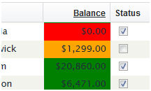
It is now possible to assign custom CSS class names to individual rows. Implement the OnDefineRowCssClass event or set the sCssClassName member of the tWebRow struct. The psCssClass set on the column object is now applied to every cell in that column (previously it was applied only to the edit cell). Combining these features means every cell can be individually addressed within the CSS stylesheet.
Example:
Object oWebList1 is a cWebList
    Object oCustomer_Balance is a cWebColumn
        Entry_Item Customer.Balance
        Set psCaption to "Balance"
        Set piWidth to 50
        Set psCSSClass to "DemoColumnBalance"
    End_Object

    Procedure OnDefineRowCssClass String ByRef sCSSClass
        Forward Send OnDefineRowCssClass (&sCSSClass)
        If (Customer.Balance < 1000) Begin
            Move "DemoRowLow" to sCSSClass
        End
        Else If (Customer.Balance > 5000) Begin
            Move "DemoRowHigh" to sCSSClass
        End
        Else Begin
            Move "DemoRowMedium" to sCSSClass
        End
    End_Procedure
End_Object
Corresponding CSS (place in Application.css):
#OWEBAPP .DemoRowLow .DemoColumnBalance {
    background-color: red;
}
#OWEBAPP .DemoRowMedium .DemoColumnBalance {
    background-color: orange;
}
#OWEBAPP .DemoRowHigh .DemoColumnBalance {
    background-color: green;
}
This changes the background color of the balance column based on the row CSS class applied.
New column types
The list and grid have been extended with multiple new column types. The new pbShowSelected property allows the list to be used without a visually selected row. Combining this with a link or button column makes the list behave more like a regular HTML table.
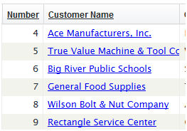
cWebColumnLink
This column type generates a link, making the value of the column clickable. The value of the clicked column and the row ID of the clicked row are passed as parameters to the OnClick event. Implement OnClick to perform custom actions such as drilling down to a details dialog or view.
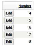
cWebColumnButton
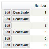
Use this column to add buttons to the list or grid. By default a single button is shown, but using the OnDefineButtons event and the AddButton API multiple buttons can be shown. The OnClick event receives the button name (for multiple buttons), row ID and column value as parameters.
Example of adding multiple buttons by implementing OnDefineButtons:
Object oDynamicBtnCol is a cWebColumnButton
    Set piWidth to 80
    Set pbDynamic to True
    Set pbRender to False

    // Called for each row to define the buttons that need to be displayed.
    Procedure OnDefineButtons
        // Use AddButton to define a button (sID, sCaption, sCSSClass)
        Send AddButton "E" "Edit" ""
        // The Global buffer contains the right record for data aware lists
        If (Customer.Status = "Y") Begin
            Send AddButton "D" "Deactivate" ""
        End
    End_Procedure

    Procedure OnClick String sButton String sRowId
        Forward Send OnClick sButton sRowId
        If (sButton = "E") Begin
            Send ShowCustomer sRowId
        End
        Else If (sButton = "D") Begin
            Send DeactivateCustomer sRowId
        End
    End_Procedure
End_Object
If a button is clicked, OnClick is triggered with the ID of the button to indicate which button was clicked.
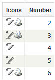
cWebColumnImage
Use this column to show one or more images inside a list or grid column. Use OnDefineImages and AddImage to provide multiple images; for a single image use the psImageUrl property.
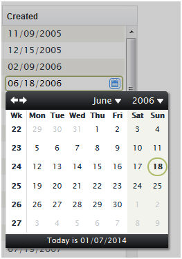
cWebColumnDate
The date picker column allows developers to use the cWebDateForm within the grid. It behaves like a regular cWebColumn but shows a prompt button that pops up the date picker.
Object oCustomerCreated is a cWebColumnDate
    Entry_Item Customer.Created
    Set psCaption to "Created"
    Set piWidth to 10
End_Object
This code placed within a cWebList works like any other column. The date picker popup is then available on this column.
File uploads (Resource Manager)
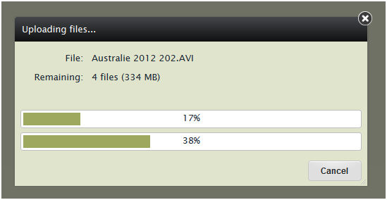
The resource manager has been extended to handle file uploads. It works using the same principles as the file download system: a standardized upload ASP script comes with the framework and an abstract interface is available within DataFlex code. Two new controls are available to integrate file uploads into any WebApp. On modern browsers the controls support drag & drop, multi-file upload and a progress bar. On older browsers the controls fall back to HTML4 file upload and lose these features.
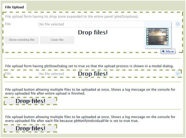
cWebFileUploadButton
The file upload button shows the file selection dialog when clicked and starts uploading the selected file(s).

Implement OnFileUpload to provide the server path where files should be stored:
Object oFileUpload is a cWebFileUploadButton
    Set piColumnSpan to 3
    Set psCaption to "Upload File(s)"

    Function OnFileUpload String sFileName Integer iBytes String sMime Returns String
        String sPath
        // Determine local path based on workspace setting
        Get psDataPath of (phoWorkspace(ghoApplication)) to sPath
        Move (sPath + "\Uploads\" + sFileName) to sPath
        Function_Return sPath
    End_Function
End_Object
A progress dialog is shown and will display upload progress on supported browsers.
cWebFileUploadForm
This control represents a single file-upload form. The prompt button opens the file selection dialog. Once a file is selected the control starts uploading the file (or waits until DoStartFileUpload is called). While uploading the control transforms into a progress bar showing progress, or a spinning wheel on older browsers. After upload finishes, the control displays details of the uploaded file.


Drag & Drop
Modern browsers support dropping files onto the browser window. The upload controls support this and the drop zone is configurable using the phoDropZone property. It defaults to the control itself but can be set to panels, views or the entire webapp.
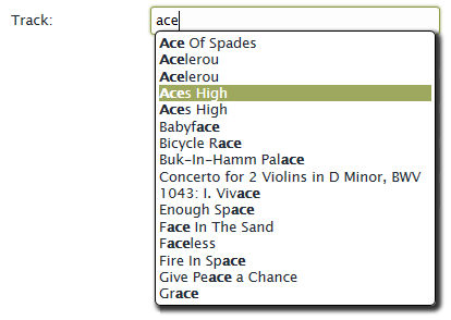
Suggestion form (cWebSuggestionForm)
A new control is available to create search fields with suggestions. It shows as a form and while typing suggestions are shown underneath the field in a floating container. cWebSuggestionForm is a subclass of cWebForm and inherits its features. The suggestion form is highly customizable: it supports multiple columns, incremental and full-text search, and multiple suggestion sources.
Configure the logic for suggestions using the peSuggestionMode property:
- Default smFind: searches suggestions in the database table and requires the field to be data-aware.
- If pbFullText is true: performs a full-text search optimized for SQL databases using the data dictionary SQL filtering API.
- smValidationTable: loads suggestions from the validation table (a good alternative to cWebCombo for large option sets).
- smCustom: implement OnFindSuggestions to provide suggestions manually by filling an array of tWebSuggestion structs.
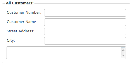
Group control (cWebGroup)
Instead of using a card container to emulate a group control, use the cWebGroup class. This component is positioned as a control but can also act as a container. It has a caption and a border (that can be hidden).
Object oCustomerContainer is a cWebGroup
    Set psCaption to "All Customers:"
    Set piColumnCount to 9
    Set piColumnSpan to 5
    Set Server to oCustomer_DD

    Object oCustomer_Customer_Number is a cWebForm
        Entry_Item Customer.Customer_Number
        Set piColumnSpan to 0
        Set psLabel to "Customer Number:"
        Set peAlign to alignLeft
    End_Object

    // ....
End_Object
Note that cWebGroup has both piColumnCount and piColumnSpan properties — it is both a control and a container.
Key handlers
You can assign custom key handlers to controls and containers using AddKeyHandler and RemoveKeyHandler. These are client actions and the administration of key handlers is kept on the client; call these procedures after the control is available on the client (commonly during OnLoad).
The system relies on HTML DOM event bubbling, so key events inside controls can be handled by their wrapping containers (a key handler on a view will catch key events on a form inside that view). If a key event is handled by a control or container it stops bubbling and other handlers will not be triggered. Default browser behavior will be canceled if possible.
The first parameter is the message handle of a published procedure that will be called when the key event occurs. The other parameters (iKeyCode, bShift, bAlt, and bCtrl) define which key event to handle and are passed back to the server. Use JavaScript key codes for iKeyCode. See the key codes reference: http://www.cambiaresearch.com/articles/15/javascript-char-codes-key-codes
Example (attach a procedure to the F1 key on load):
Procedure InfoKey Integer iKeyCode Boolean bShift Boolean bAlt Boolean bCtrl
    Send ShowInfoBox "This is an information dialog!"
End_Procedure
WebPublishProcedure InfoKey

Procedure OnLoad
    Send AddKeyHandler (RefProc(InfoKey)) 112 False False False
End_Procedure
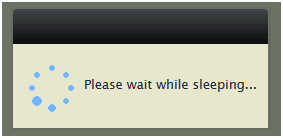
Action modes and wait dialogs (SetActionMode)
This feature allows developers to configure a wait dialog for any server action. Instead of adding properties for every server action there is a procedure that tells the JavaScript engine to send an action in a specific mode. SetActionMode takes a message handle to the published procedure or function as a parameter.
Example (show a wait dialog during a long menu action):
Object oMenuItem is a cWebMenuItem
    Set psCaption to "Long process"

    Procedure OnLoad
        Forward Send OnLoad
        Send SetActionMode (RefProc(OnClick)) scModeProgress "Please wait while sleeping..."
    End_Procedure

    Procedure OnClick
        // Do something long
        Sleep 4
    End_Procedure
End_Object
Available action modes:
- scModeProgress: shows a progress dialog with message.
- scModeWait: locks the UI and shows a wait cursor.
- scModeDefault: does not lock the UI or show a wait cursor.
When a server action triggers another server action (like ProcessDataSet on cWebList) the wait dialog remains until the new server action is processed.
Cookie functions
DataFlex functions are available for reading and writing cookies:
- GetCookie reads a cookie key by name directly from the HTTP header.
- SetCookie updates a cookie key by passing its name, value and expiration in hours. An expiration of 0 sets a session cookie.
Note: SetCookie is a client-action and is asynchronous. GetCookie will not return the new value until the next call arrives.
Error handling improvements
Work has been done to improve the error handling of the framework. The error system is now simplified, making it easier to control and more predictable.
Errors became client-actions
Errors are now sent to the client as regular client-actions. This ensures they are executed in order with other client actions. For example:
Send ShowInfoBox "An error is about to happen!"
Send UserError "Something awful happened!"
The info box will be shown before the error, preserving execution order.
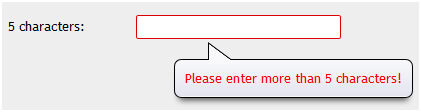
Field error API
Field errors can now be shown on non-data-bound fields using ShowControlError and HideControlError. Note that setting a WebSet of psValue and a successful OnValidate clears all errors. Use HideAllControlErrors to hide all errors. Combined with OnValidate, developers can implement field validations that behave like data-aware field validations.
Example custom validation on a form:
Object oForm is a cWebForm
    Set piColumnSpan to 6
    Set psLabel to "5 characters:"
    Set pbServerOnValidate to True

    Function OnValidate Returns Boolean
        Boolean bRetVal
        String sVal
        Forward Get OnValidate to bRetVal
        WebGet psValue to sVal
        If (Length(sVal) < 5) Begin
            Move False to bRetVal
            Send ShowControlError 1 "Please enter more than 5 characters!"
        End
        Function_Return bRetVal
    End_Function
End_Object
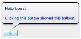
Info balloons
You can show information balloons next to a control using ShowInfoBalloon. HideInfoBalloon hides the balloon. The balloon will be visible for a few seconds and reappear when the control is hovered.
Example:
Object oWebButton1 is a cWebButton
    Set piColumnSpan to 1
    Set psCaption to "?"

    Procedure OnClick
        Send ShowInfoBalloon "" "Hello Users!\nClicking this button showed this balloon!"
    End_Procedure
End_Object
HTML can be used as the balloon content.
Progress bar (cWebProgressBar)
A progress bar control can be used within panels, views and dialogs. cWebProgressBar has piValue and piMaxValue properties that control the current state. A Progress procedure is available to increment the value.
Object oWebProgressBar1 is a cWebProgressBar
    Set psLabel to "cWebProgressBar:"
    Set pbShowLabel to True
    Set piValue to 33
    Set piColumnSpan to 6
End_Object
Note: the label is disabled by default and can be enabled using pbShowLabel.
