Web Framework 19.0
The web property system has been extended with a new web property type called Server Web Properties. The new Server Web Properties are not sent to the client; rather, they are stored on the application server to provide persistency until the next request from the web client comes in. The goal of the Server Web Properties is to provide an easy and secure method to store an application’s state without the state information being sent to the client. In addition to security, they can also improve performance compared to client-side web properties because the property data is not exchanged between the Client and Server.
The default server properties are bound to the page scope, which means that they will live just as long as client web properties (until the page is reloaded/left). Also available are ServerSession properties that are bound to the session and will be accessible until the session expires.
How to Use Server Web Properties
Server web properties are used exactly like existing client web properties by using WebGet and WebSet. Set and Get can be used to access the initial value when a session is initialized. The WebProperty meta tag has been changed with the new Server and ServerSession options.
-
{ WebProperty=Client }: The original client-side web property. Its value is sent to the client and can be used by the JavaScript engine. -
{ WebProperty=Server }: The new server-side web property attached to the page scope (clears when the page is reloaded). Its value stays on the server and is not accessible on the client. -
{ WebProperty=ServerSession }: The new server-side web property that is attached to the session (expires together with the session). Its value stays on the server and is not accessible on the client. -
{ WebProperty=True }: This value will become deprecated. It works as{ WebProperty=Client }to maintain backwards compatibility.
WebAppServerProps Table
The server web properties are stored in the database. For this, a new system table is added called WebAppServerProps. This table is automatically added to new projects, and when migrating, it will be added when the JavaScript Engine is updated for the first time. By default, this is an embedded table, but it is advised to convert this table to the database being used by the rest of the application. It is recommended to increase the size of the data field when the database allows this. When converting to MS SQL, the conversion wizard will automatically change the field into a varchar(max) field with a DataFlex size of 1 MB.
The table contains an ExpiresDate field that can be used for automated cleanup of the data, as the framework will not delete records by itself. It is advised to schedule a job inside SQL Server to do this.
When to Use Server Properties?
In general, every web property can become a server property as long as there is no JavaScript that relies on it. So if a web property is created within an application without JavaScript being added that uses it, then it is advised to make this a server web property. The performance of server properties will depend on the amount of data stored in them, but in general, they are expected to be faster than client web properties.
Studio Support for Server Properties
The Studio automatically adds the WebAppServerProps table to a workspace the first time a web application is created in a workspace (along with the WebAppSession and WebAppUser tables). For workspaces that were created prior to DataFlex 19.0 (or don't have the WebAppServerProps table for any reason), the table is automatically added whenever the JavaScript Engine is updated.
DataFlex 2017/19.0 includes exciting additions to the control set for the Web Framework Desktop and Mobile/Touch style applications.
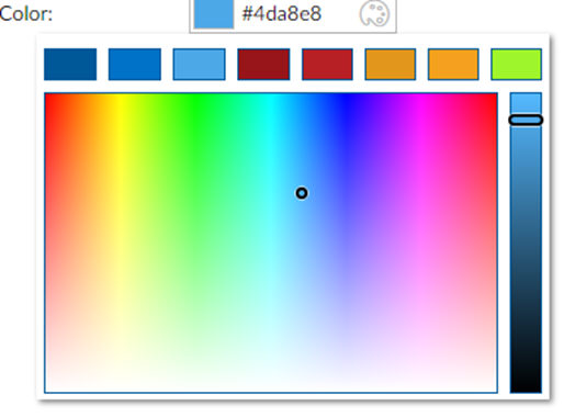
Color Pickers
You can now use color picker controls that are available in popup format (cWebColorForm) and as a standalone control (cWebColorPicker). These controls can show a color palette with predefined colors as well. You can see color pickers in the WebOrder example under Demo | Color Picker.
Example - cWebColorForm (with palette):
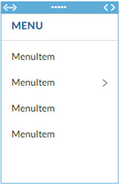
Mobile/Touch List Menu
The cWebMenuList is a separate version of the menu class used in Mobile Touch applications. It works with existing menu items, supports multiple menu levels, has an optional header, and automatically renders a back button on sub-levels. You can see these capabilities in the DataFlex 2017 WebOrder example program under Demo | List Button Menu.
Example (in the Designer):
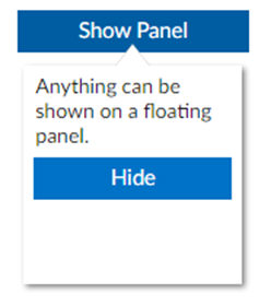
Floating Panel
The cWebFloatingPanel is a versatile new container component that can be positioned in several ways. It falls outside the control & regular panel layout flow and "floats” on top of the application. It can be used to develop menu systems and provide extra details. You can see floating panels in the DataFlex 2017 WebOrder example under Demo | Floating Panel and Search with Floating Panel.
FloatByControl
Using phoFloatByControl, the panel is configured to float below (or if there is not enough space above) a specific control.
FloatLeftSqueezeWebApp
The panel shows outside of the web app and squeezes the web app, making space for itself. This is a common way to display menus. It spans the full height of the browser.
FloatLeftPushWebApp
The panel shows outside of the web app and pushes the web app (partially off-screen) to make space for itself. This is a common method to display a menu on mobile devices.
FloatFixed
The panel is positioned absolutely using coordinates.
Example - cWebFloatingPanel floating by a button:
Example - cWebFloatingPanel pushing the web app off-screen:
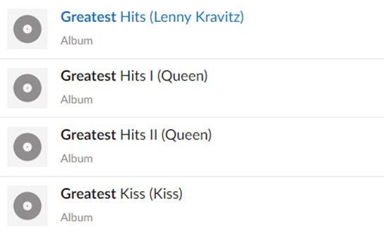
Highlight Column
The cWebColumnHighlight is a special column type that is capable of highlighting keyword(s). It has several options to configure how the highlighting should be performed.
Example - cWebColumnHighlight highlighting "Greatest":
Accordion Control
The cWebAccordionContainer is an accordion-style mobile control based on the tab/card container technology. The cWebAccordionCards expand/collapse by clicking on the header or can be controlled from source code. It can be configured to allow a single expanded item or multiple expanded items. You can see accordion cards in the DataFlex 2017 WebOrder example under Demo | Accordion Demo.
Collapsible Group
Extends the cWebGroup with a pbExpandible property, making it show a collapse/expand button on top.
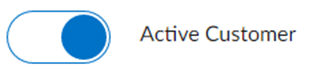
Styled Checkbox and Radio
The DataFlex framework has always used the native browser’s checkbox. Browsers usually leave the rendering up to the operating system. Styling (using CSS) was very limited. A new technique using special CSS selectors and a pseudo element allows this system default checkbox to be replaced with a custom checkbox fully built and stylable for your DataFlex web app using CSS. This new technology has been incorporated into the DataFlex Framework, allowing developers to let themes style the checkbox or just use the device’s native checkbox control. You can see these new DataFlex 2017 capabilities in the WebOrder example under Demo | Styled Checkboxes and Radios.
Example - Standard Flat (touch and desktop) checkbox:

Example - Styled as a flipswitch using standard "FlipSwitch" CSS Class:
Swipe Buttons (in Lists) and Cards
Swipe to Next Card
A commonly requested mobile/web app feature has been a “card” container that shows dots at the bottom corner indicating that there are more available cards and allows the user to “swipe” to the next card. DataFlex 2017/19.0 includes a swipe card mobile/touch control.
Example:
-
The
cWebPromptListwas changed to use the callback object ofcWebModalDialogto determine the opening object instead of looking at the focus object, which was causing multiple problems. To do this,cWebBaseDEOhas been altered to use thePopupfunction to show the lookup instead of using theShowfunction. -
The
cWebPromptList’s “Ok” function now also triggersNotifyCloseModalDialog, causing theOnCloseModalDialogto be called concurrently for lookups in the default format. -
The default format of lookups generated by the Web Lookup Wizard was changed to not use
OnShowbut rather to augmentPopup, since that is now the recommended method for modal dialogs. -
The lookups in the WebOrder sample were changed to augment
Popupinstead of usingOnShow.
JavaScript Engine Build Notes
The full Build Notes for the JavaScript Engine are provided for those interested. This is temporary documentation during the Alpha release.